You’ve got traffic coming to your website. That’s great. But here’s the problem I see all the time, visitors land on your pages, browse around for a minute or two, and then vanish without taking action. No form submission. No phone call. Nothing.
It’s frustrating, right? You’ve invested in your website, maybe even in SEO or paid ads to drive people there. But somewhere between the landing page and the conversion, you’re losing them.
Here’s the good news: there’s one stupidly simple change you can make right now that’ll boost your conversion rate faster than any elaborate redesign or expensive marketing campaign. And I’ve seen it work for service businesses time and time again.
Ready to find out what it is? Let’s dive in.
The One Change That Makes the Biggest Difference
Cut your form fields down to the bare essentials.
That’s it. That’s the trick.
I know it sounds almost too simple, but hear me out. I’ve worked with dozens of service businesses who had these long, detailed contact forms asking for everything, full name, company name, phone number, email, address, project budget, timeline, how they heard about you, and probably their dog’s name too.

And you know what happened? People would start filling out the form, get overwhelmed by all the fields, and bounce. According to recent conversion research, every additional form field you add can drop your conversion rate by around 5-10%. That adds up fast.
Think about it from your visitor’s perspective. They’re already taking a risk by reaching out to you, they don’t know you yet, they’re not sure if you’re the right fit, and now you’re asking them to fork over their entire life story just to start a conversation?
Too much friction.
When I help clients streamline their forms down to just name and email (or name, email, and one qualifying question at most), we typically see conversion rates jump by 20-40%. That’s not a typo. One simple change, and suddenly you’re capturing way more leads.
Why This Works (And Why You’ve Been Doing It Wrong)
Here’s the thing about conversion optimization, it’s all about reducing friction between your visitor and their goal. Every extra field, every extra click, every extra second of load time is friction that gives people a reason to second-guess and leave.
I’ve seen countless service businesses fall into the trap of thinking they need to collect all this information upfront. “But we need to qualify leads!” they tell me. “We need to know their budget before we waste time on a call!”
I get it. But you’re putting the cart before the horse.
Your contact form isn’t supposed to close the deal or fully qualify the prospect, that’s what the follow-up call or email is for. Your form has one job: get them to raise their hand and express interest. That’s it. Everything else can come later.

Think of it like dating. You don’t propose marriage on the first date. You start with a simple conversation, see if there’s mutual interest, and build from there. Same principle applies to your website forms.
The businesses I work with who embrace this mindset see dramatic improvements. A local HVAC company I helped last year was asking for seven form fields. We cut it down to three. Their lead volume doubled in the first month, and guess what? The quality of leads stayed exactly the same because they were qualifying them during the initial phone conversation instead.
Beyond Forms: 4 More Quick Wins for Conversion Rate Optimization
Alright, so you’ve simplified your forms. What else can you do right now to boost conversions? Let me share four more tactics that I’ve seen move the needle fast.
1. Make Your Call-to-Action Impossible to Ignore
Your CTA button shouldn’t blend into your website like a chameleon. It should jump off the page and practically scream “click me!”
Use contrasting colors that stand out from your site’s design. If your site is mostly blue, make your CTA button orange or red. Make the button big enough to tap easily on mobile (at least 44×44 pixels). And for the love of all things digital, make your copy action-oriented and specific.
Instead of “Submit” or “Learn More,” try “Get Your Free Quote” or “Book Your Strategy Call.” See the difference? You’re telling people exactly what they’ll get when they click.
I worked with a professional services firm that changed their CTA from “Contact Us” to “Start Growing Your Revenue Today”: same button, same placement, just different copy. That one change increased their click-through rate by 28%.
2. Speed Up Your Site (Your Visitors Have Zero Patience)
Here’s a stat that should wake you up: if your website takes longer than three seconds to load, you’re losing roughly 40% of your visitors before they even see your content.
Three seconds. That’s all the patience people have these days.

I’ve seen businesses pour thousands into their website design, writing, and imagery: only to watch their bounce rates skyrocket because the site loads like molasses. It’s like having a beautiful storefront that people have to wait five minutes for the door to unlock. They just walk away.
Quick fixes you can implement today:
- Compress your images (use tools like TinyPNG or ImageOptim)
- Enable browser caching
- Minimize JavaScript and CSS files
- Consider switching to a faster web host if you’re on a budget option
If you’re serious about conversion-focused website design, speed isn’t optional: it’s fundamental. Every tenth of a second matters.
3. Simplify Your Navigation (Decision Fatigue is Real)
You know what kills conversions? Giving people too many options.
When someone lands on your website, they should have a clear path forward. But I see service business websites all the time with navigation menus that look like they’re trying to be Amazon: 15 different menu items, dropdown menus three levels deep, and sidebar links competing for attention.
Your visitors end up suffering from what psychologists call “decision paralysis.” With too many choices, they freeze up and choose nothing.
Strip it back. Your main navigation should have 5-7 items max. Each page should have one primary goal and one clear CTA that supports that goal. Guide your visitors on a journey instead of dumping them at a crossroads with no map.
A law firm I worked with had 12 items in their main nav. We consolidated down to 6 core items, moved secondary content to the footer, and made their “Free Consultation” button prominent. Their consultation requests increased by 35% within two months.
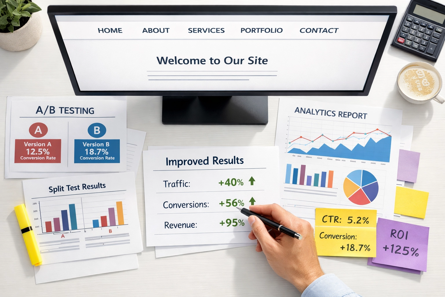
4. Test Everything (Assumptions Are Expensive)
Here’s something I tell every client: you don’t actually know what works best until you test it.
You might think your headline is killer. You might be convinced that big hero image is converting like crazy. But until you run an A/B test comparing it to alternatives, you’re just guessing: and guesses cost you money.

The beautiful thing about conversion rate optimization is that you can measure everything. Test different headlines. Test different CTA button colors. Test different form placements. Test shorter vs. longer copy. Test testimonials in different positions.
I’m not saying you need to become a data scientist. Even simple A/B tests using tools like Google Optimize (it’s free) can reveal insights that dramatically improve your conversions.
One client tested two different headlines on their homepage. Version A was feature-focused: “Full-Service Digital Marketing Agency.” Version B was benefit-focused: “We Help Service Businesses Generate More Quality Leads.” Version B crushed it: 53% higher conversion rate. Same page, same design, just different words.
That’s the power of testing. Small changes, massive results.
The Real Secret? Remove Friction Everywhere
Look, I could give you a list of 50 tactics for improving your website’s conversion rate. But at the end of the day, they all boil down to one principle: remove friction.
Every element on your website should either move visitors closer to converting or get out of the way. That’s it. No middle ground.
Ask yourself these questions about every page on your site:
- What’s the one action I want visitors to take here?
- What’s stopping them from taking that action?
- How can I remove those barriers?
When you start thinking about conversion optimization through this lens, the answers become pretty obvious. Long forms? Friction. Slow loading times? Friction. Confusing navigation? Friction. Weak CTAs? Friction.
I’ve been helping service businesses optimize their websites for conversions for years now, and the pattern is always the same: the businesses that win are the ones that obsess over removing every tiny point of friction in their visitor’s journey.
If you’re looking to build a website that actually converts browsers into buyers, or if your current site needs an optimization overhaul, our team specializes in this exact challenge. We’ve helped everyone from HVAC companies to law firms to dental practices transform their websites into lead-generation machines.
Start With Forms, But Don’t Stop There
So here’s your action plan: go look at your contact forms right now. Count the fields. If you’ve got more than three or four, start cutting. Ask yourself what information you actually need to start a conversation versus what you’d like to know eventually.
Then move on to the other tactics we covered: your CTAs, your site speed, your navigation, and your testing strategy. Each one compounds on the others. You cut your form fields and see a 20% lift. Then you optimize your CTA and add another 15%. Then you speed up your load time and gain another 10%.
Before you know it, you’ve doubled your conversion rate without spending a dime on additional traffic.
That’s the beauty of conversion rate optimization: it multiplies the value of every visitor you already have. It’s like finding money you didn’t know was sitting on the table.
Ready to turn your website into a conversion machine? Start with those forms today. I promise you’ll see results faster than you think.